Have you ever wanted to build a docs site for your open-source library or side project?
Docusaurus is a popular framework for generating docs from Markdown/MDX files and it does a great job! However, perhaps you have already an existing Next.js website so don’t want to create another one from a whole new codebase or on another domain.
In this post, we’ll build a static docs generator powered by Next.js and Contentlayer. Contentlayer is something like Prisma for local Markdown content — you define the schema of documents to make Contentlayer generate validated (so type-safe) JSON data you can import from anywhere.
What we’ll build in this post
Docs built with Next.js and Contentlayerwww.youtube.com

Create a Next.js app and install dependencies
Now, let’s get started from creating a new Next app. Make sure to opt-in to TypeScript.
pnpm create next-app
# And answer the prompts
pnpm add contentlayer next-contentlayer sass clsx @heroicons/react remark-gfm rehype-prism-plus
Connect Contentlayer with Next.js
Follow the Getting Started to integrate Contentlayer into Next.js.
// next.config.mjs
import { withContentlayer } from "next-contentlayer";

/** @type {import('next').NextConfig} */
const nextConfig = {
  reactStrictMode: true,
  swcMinify: true,
};

module.exports = withContentlayer(nextConfig);
A cool thing is that Contentlayer triggers Fast Refresh as you edit Markdown content, while you need manual reloads with a naive fs.readFile approach.
Define Contentlayer document
Then, we’ll define a Docs schema. You may feel familiar with this (and code generation) if you have ever used Prisma.
We included remark-gfm to support GitHub Flavored Markdown and rehype-prism-plus for syntax highlight of code blocks.
// contentlayer.config.ts
import { defineDocumentType, makeSource } from "contentlayer/source-files";
import rehypePrismPlus from "rehype-prism-plus";
import remarkGfm from "remark-gfm";

export const Docs = defineDocumentType(() => ({
  name: "Docs",
  filePathPattern: `docs/**/*.mdx`,
  contentType: "mdx",
  fields: {
    id: {
      type: "string",
    },
    title: {
      type: "string",
      required: true,
    },
  },
  computedFields: {
    id: {
      type: "string",
      resolve: (doc) => doc.id || doc._raw.flattenedPath.replace("docs/", ""),
    },
    slug: {
      type: "string",
      resolve: (doc) => doc._raw.flattenedPath.replace("docs/", ""),
    },
  },
}));

export default makeSource({
  contentDirPath: "content",
  documentTypes: [Docs],
  mdx: {
    remarkPlugins: [remarkGfm],
    rehypePlugins: [[rehypePrismPlus, { ignoreMissing: true }]],
  },
});
Add MDX content
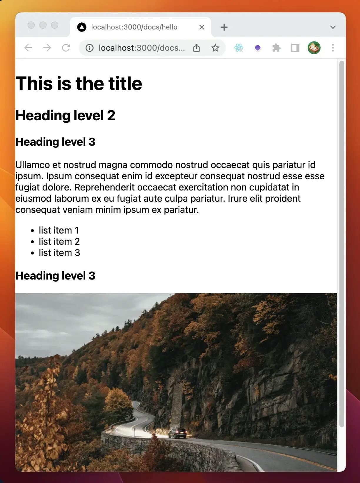
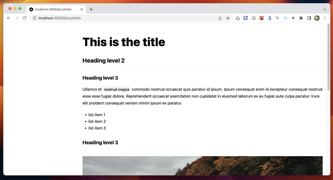
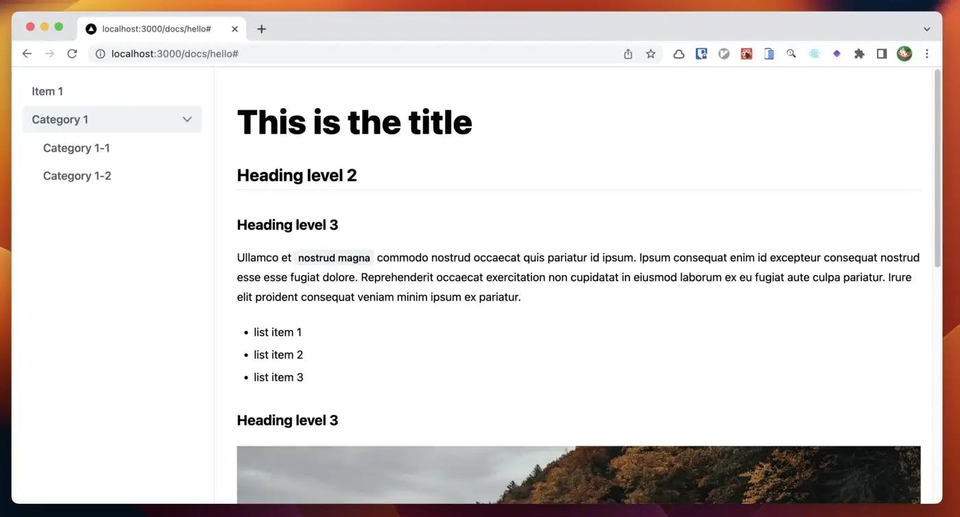
Let’s write MDX content and add it under content/docs directory. Make sure to put an image named car.jpg in /public directory.
## /content/docs/sample.mdx
id: "sample"
title: "This is the title"
---
## Heading level 2
### Heading level 3
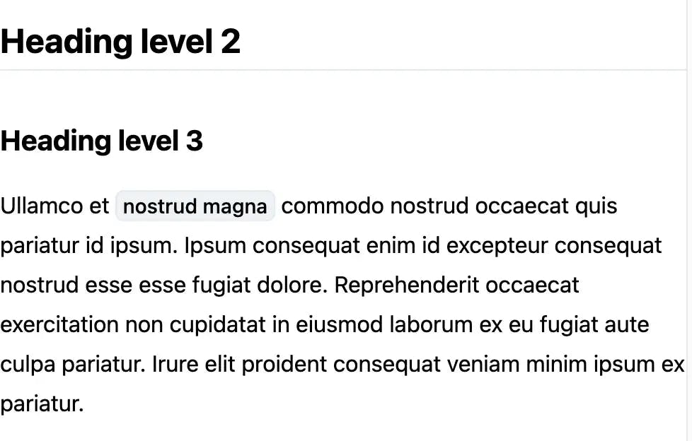
Ullamco et `nostrud magna` commodo nostrud occaecat quis pariatur id ipsum. Ipsum
consequat enim id excepteur consequat nostrud esse esse fugiat dolore.
Reprehenderit occaecat exercitation non cupidatat in eiusmod laborum ex eu
fugiat aute culpa pariatur. Irure elit proident consequat veniam minim ipsum ex
pariatur.
- list item 1
- list item 2
- list item 3
### Heading level 3

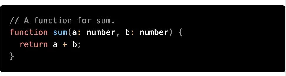
`ts function sum(a: number, b: number) { return a + b } `
Line at the top is the file name. Don’t include it!
Create a dynamic route for docs pages
Now, you can easily import all the docs from contentlayer/generated with validated and typed metadata. No need to dig into the file structure or handle invalid content. Clean!
// /pages/docs/[...slug].tsx
import React from "react";
import { GetStaticPathsResult, GetStaticPropsContext } from "next";
import { useMDXComponent } from "next-contentlayer/hooks";
import { allDocs, type Docs } from "contentlayer/generated";

type Props = {
  doc: Docs;
};

export default function DocsPage({ doc }: Props) {
  const MDXContent = useMDXComponent(doc.body.code);
  return (
    <div>
      <h1>{doc.title}</h1>
      <MDXContent />
    </div>
  );
}

export async function getStaticProps({ params }: GetStaticPropsContext) {
  const slug = params?.slug;
  if (!Array.isArray(slug)) {
    return {
      notFound: true,
    };
  }
  const doc = allDocs.find((post) => post.slug === slug.join("/"));

  if (!doc) {
    return { notFound: true };
  }

  const props: Props = {
    doc,
  };

  return {
    props,
  };
}

export async function getStaticPaths(): Promise<GetStaticPathsResult> {
  const paths = allDocs.map((doc) => ({
    params: { slug: doc.slug.split("/") },
  }));

  return {
    paths,
    fallback: false,
  };
}
Add CSS files Before writing styles, we’d like to add global CSS files.
// /pages/_app.tsx
import "../styles/normalize.css"; // Reset browser defaults
import "../styles/tokens.css"; // Includes CSS variables
import "../styles/prism.css"; // Syntax highlight
If Prism is working correctly, code blocks (surrounded by triple backticks) look pretty like the below:
Style MDX content
We’d like to style the article by wrapping <MDXContent /> with <Markup /> component. This is not the only way but the simplest solution.
/// components/Markup/index.tsx
import React from "react";
import styles from "./styles.module.scss";

type Props = {
  children?: React.ReactNode;
};

export default function Markup({ children }: Props) {
  return <div className={styles.container}>{children}</div>;
}
// /components/Markup/styles.module.scss
.container {
  :where(h2, h3, h4) {
    margin-top: 2.25rem;
    margin-bottom: 1.2rem;
    line-height: 1.3;
  }

  :where(table, img, blockquote) {
    margin-top: 1.5rem;
    margin-bottom: 1.5rem;
  }

  :where(p) {
    margin-top: 1rem;
  }

  :where(ul, ol):not(:first-child) {
    margin: 1.5rem 0;
  }

  :where(ul, ol) :where(ul, ol) {
    // margin-top should be the same as the gap of list items.
    margin: 0.5rem 0 0 0;
  }

  > *:first-child {
    margin-top: 0;
  }

  :where(h2) {
    font-weight: var(--font-weight-bold);
    font-size: var(--font-size-2xl);
    border-bottom: 1px solid var(--color-gray-200);
    padding-bottom: 0.3rem;
  }

  :where(h3) {
    font-weight: var(--font-weight-bold);
    font-size: var(--font-size-xl);
  }

  :where(h4) {
    font-weight: var(--font-weight-bold);
    font-size: var(--font-size-lg);
  }

  :where(a) {
    color: var(--color-primary-600);
    font-weight: var(--font-weight-medium);

    &:hover {
      text-decoration: underline;
    }
  }

  :where(code):not([class*="language-"]) {
    background-color: var(--color-gray-100);
    padding: 0.1em 0.3em;
    border: 1px solid var(--color-gray-200);
    border-radius: var(--rounded-md);
    font-family: var(--font-family-code);
    font-weight: var(--font-weight-medium);
    font-size: 0.9em;
    overflow: auto;
  }

  :where(pre):not([class*="language-"]) {
    // Firefox doesn't support :has() yet, but OK as not so important.
    &:has(code) {
      margin-top: 2rem;
      margin-bottom: 2rem;
    }
  }

  :where(blockquote) {
    border-left: 0.2rem solid var(--color-gray-300);
    padding-left: 1em;
  }

  :where(ul, ol) {
    padding-left: 1.5rem;
    display: flex;
    flex-direction: column;
    gap: 0.5rem;
  }

  :where(ul) {
    list-style: disc;
  }

  :where(ul[class~="contains-task-list"]) {
    list-style: none;
  }

  :where(ol) {
    list-style: decimal;
  }

  :where(p) {
    line-height: 1.75;
  }
}
// /pages/docs/[...slug].tsx
export default function DocsPage({ doc }: Props) {
  return (
      {...}
      <Markup>
        <MDXContent />
      </Markup>
      {...}
  );
}
Layout for the sidebar navigation
Then, let’s create a layout for the sidebar navigation.
// /components/DocsTemplate/index.tsx
import { useMDXComponent } from "next-contentlayer/hooks";
import { type Docs } from "contentlayer/generated";
import Markup from "../Markup";
import styles from "./styles.module.scss";

type Props = {
  doc: Docs;
};

export default function DocsTemplate({ doc: { title, body } }: Props) {
  const MDXContent = useMDXComponent(body.code);
  return (
    <div className={styles.container}>
      <div />
      <article className={styles.article}>
        <header className={styles.header}>
          <h1 className={styles.title}>{title}</h1>
        </header>
        <Markup>
          <MDXContent />
        </Markup>
      </article>
    </div>
  );
}
// /components/DocsTemplate/styles.module.scss
.container {
  display: grid;
  grid-template-columns: 18rem 1fr;
  column-gap: 1rem;
}

.article {
  padding: 1rem;
}

.header {
  padding-bottom: 2rem;

  .title {
    font-weight: var(--font-weight-extrabold);
    font-size: var(--font-size-5xl);
    line-height: 1.2;
    margin: 0;
  }
}
// /pages/docs/[...slug].tsx
export default function DocsPage({ doc }: Props) {
  return <DocsTemplate doc={doc} />;
}
Create Sidebar component
We want to make navigation accept arbitrary levels of nested categories like /category/article.mdx and /cateogry/another-category/article.mdx.
To support this, we define a recursive type (not an official name) as follows:
// /types.ts
export type NavItemCategory = {
  id: string;
  label: string;
  open?: boolean;
  items: NavItem[]; // Self reference
};

export type NavItemLink = {
  id: string;
  label: string;
  href: string;
};

export type NavItem = NavItemCategory | NavItemLink;
And Sidebar component handles the passed data in a recursive way:
// /components/Sidebar/index.tsx
import { ChevronRightIcon } from "@heroicons/react/20/solid";
import clsx from "clsx";
import Link from "next/link";
import { useRouter } from "next/router";
import React from "react";

import { NavItem } from "../../types";

import styles from "./styles.module.scss";

type Props = {
  items: NavItem[];
};

export default function Sidebar({ items }: Props) {
  return (
    <nav className={styles.container}>
      <ul className={styles.list}>
        {items.map((item) => (
          <Item key={item.id} item={item} />
        ))}
      </ul>
    </nav>
  );
}


type ItemProps = {
  item: NavItem;
};

function Item({ item }: ItemProps) {
  const router = useRouter();
  const isActive = React.useCallback(
    (href: string) => href === router.asPath,
    [router.asPath]
  );

  if ("items" in item) {
    // Category
    return (
      <li className={styles.category}>
        <details>
          <summary className={styles.button}>
            {item.label}
            <ChevronRightIcon />
          </summary>
          <ul className={styles.list}>
            {item.items.map((item) => (
              <Item key={item.id} item={item} /> {/* Recursion */}
            ))}
          </ul>
        </details>
      </li>
    );
  } else {
    // Document link
    return (
      <li key={item.href}>
        <Link
          href={item.href}
          className={clsx(
            styles.button,
            isActive(item.href) && styles.isActive
          )}
          aria-current={isActive(item.href) ? "page" : undefined}
        >
          {item.label}
        </Link>
      </li>
    );
  }
}
// /components/Sidebar/styles.module.scss
$rowGap: 0.25rem;

.container {
  padding: 1rem;
  border-right: 1px solid var(--color-gray-200);
  height: 100vh;
  position: sticky;
  top: 0;
}

.list {
  display: grid;
  row-gap: $rowGap;
  color: var(--color-gray-600);
}

.category {
  details[open] {
    > summary svg {
      rotate: 90deg;
    }
  }

  summary {
    display: flex;
    align-items: center;
    justify-content: space-between;
    user-select: none;

    svg {
      width: 1.6rem;
      height: 1.6rem;
      color: var(--color-gray-500);
      translate: 0.25rem;
    }
  }

  summary::-webkit-details-marker {
    display: none;
  }

  ul {
    margin-left: 1rem;
    margin-top: $rowGap;
  }
}

.button {
  display: flex;
  padding: 0.3rem 0.75rem;
  border-radius: var(--rounded-md);
  font-weight: var(--font-weight-medium);
  transition: var(--transition-bg);
  border: 1px solid transparent;
  cursor: pointer;
  width: 100%;

  &.isActive {
    font-weight: var(--font-weight-semibold);
    color: var(--color-primary-500);
    background-color: var(--color-gray-50);
    border-color: var(--color-gray-200);
  }

  &:hover {
    background-color: var(--color-gray-100);
  }
}
Test Sidebar with dummy data
// /components/DocsTemplate/index.tsx
export default function DocsTemplate({ doc: { title, body } }: Props) {
  const MDXContent = useMDXComponent(body.code);
  return (
    <div className={styles.container}>
      <Sidebar
        items={[
          {
            id: "item1",
            href: "#",
            label: "Item 1",
          },
          {
            id: "category1",
            label: "Category 1",
            items: [
              {
                id: "category1-1",
                label: "Category 1-1",
                href: "#",
              },
              {
                id: "category1-2",
                label: "Category 1-2",
                href: "#",
              },
            ],
          },
        ]}
      />
      <article className={styles.article}>
       {...}
      </article>
    </div>
  );
}
Seems like it’s working! The category is handled correctly.
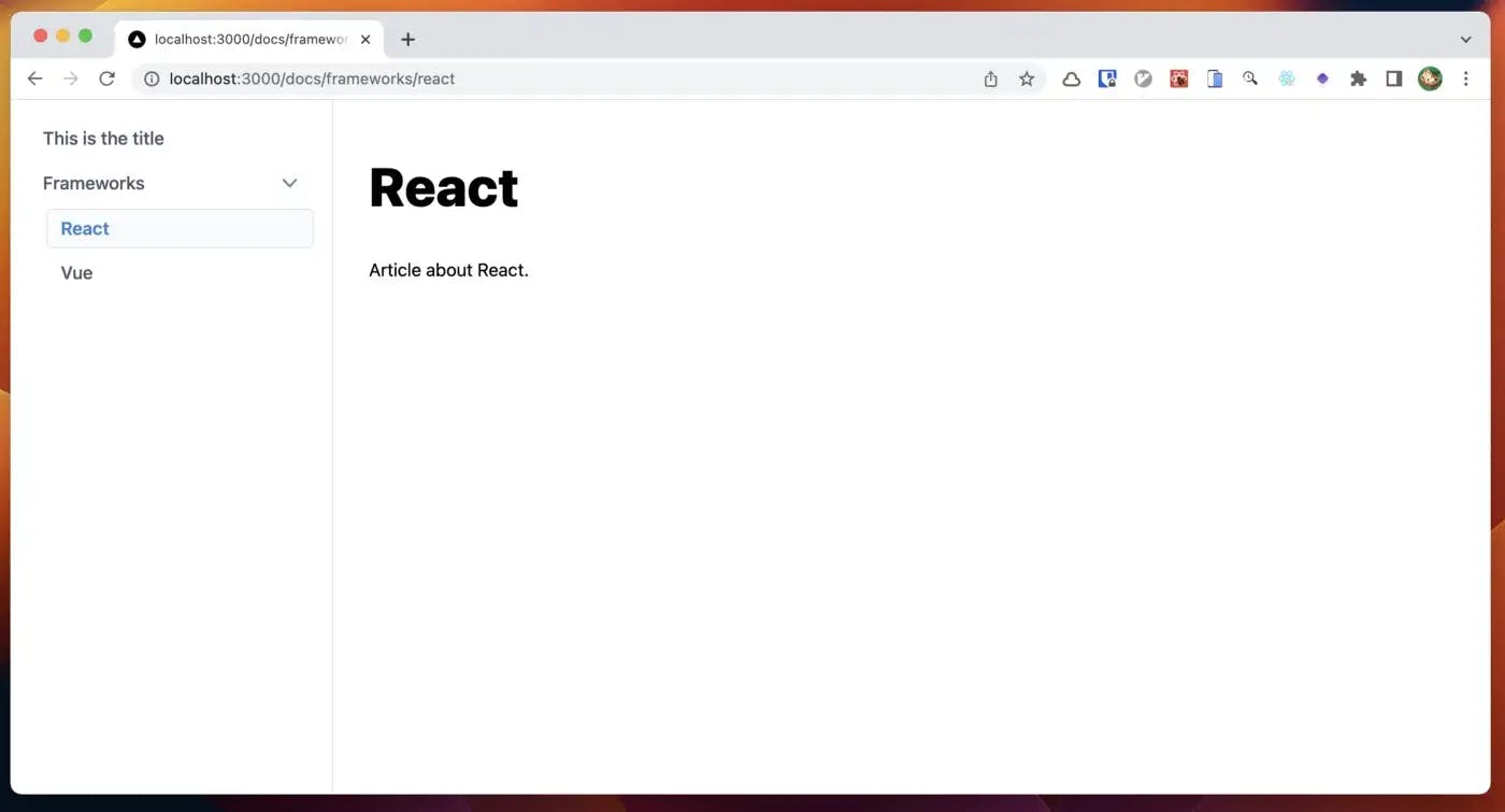
Sidebar data from real content
Add categorized docs
## /content/docs/frameworks/react.mdx

id: "react"
title: "React"

---

Article about React.
## /content/docs/frameworks/vue.mdx

id: "vue"
title: "Vue"

---

Article about Vue.
Define sidebar config
We'd like to specify the order and categories in sidebar.js. For the config file, we define types to remove href and make label optional (and default to the title) as follows:
// /types.ts
type Optional<T, K extends keyof T> = Pick<Partial<T>, K> & Omit<T, K>;

export type DocsSidebarItemConfig =
  | NavItemCategory
  | Optional<Omit<NavItemLink, "href">, "label">;

export type DocsSidebarConfig = {
  items: DocsSidebarItemConfig[];
};
// /sidebar.js
/** @type {import('./types').DocsSidebarConfig} */
const sidebar = {
  items: [
    {
      id: "sample",
    },
    {
      id: "frameworks",
      label: "Frameworks",
      items: [
        {
          id: "react",
        },
        {
          id: "vue",
        },
      ],
    },
  ],
};

export default sidebar;
// /lib/docs.ts
import { allDocs } from "contentlayer/generated";
import sidebar from "../sidebar";
import { NavItem, DocsSidebarItemConfig, NavItemLink } from "../types";

export function getSidebarItems(
  items: DocsSidebarItemConfig[] = sidebar.items
) {
  const result: NavItem[] = [];
  for (const item of items) {
    if ("items" in item) {
      // Category
      result.push({
        ...item,
        items: getSidebarItems(item.items),
      });
    } else {
      // Document link
      const doc = allDocs.find((d) => d.id === item.id);
      if (!doc) continue;
      result.push({
        ...item,
        href: "/docs/" + doc.slug,
        label: item.label ?? doc.title,
      });
    }
  }
  return result;
}
// /components/DocsTemplate/index.tsx
type Props = {
  doc: Docs;
  sidebarItems: NavItem[];
};

export default function DocsTemplate({
  doc: { title, body },
  sidebarItems,
}: Props) {
  const MDXContent = useMDXComponent(body.code);
  return (
    <div className={styles.container}>
      <Sidebar items={sidebarItems} />
      <article className={styles.article}>
       {...}
      </article>
    </div>
  );
}
Call getSidebarItems() to get navigation items for the sidebar.
// /pages/docs/[...slug].tsx
type Props = {
  doc: Docs;
  sidebarItems: NavItem[];
};

export default function DocsPage({ doc, sidebarItems }: Props) {
  return <DocsTemplate doc={doc} sidebarItems={sidebarItems} />;
}

export async function getStaticProps({ params }: GetStaticPropsContext) {
  //  {...}
  const doc = allDocs.find((post) => post.slug === slug.join("/"));
  const sidebarItems = getSidebarItems();
  //  {...}
  const props: Props = {
    doc,
    sidebarItems,
  };
  //  {...}
}
It works just like expected!
Still much more to do…
We could build a simple docs generator but there are so many missing things:
- Image optimization by next/image
- Table of contents
- Next/previous navigation
- File name for code blocks
- Anchor link for each heading
- Using React components inside .mdx files
- On mobile devices, the sidebar should be hidden and expanded as a modal menu
Saazy Template supports all the missing features!

I built Saazy Template, a Next.js starter for marketing that includes:
- Landing page
- Pricing page
- Sign in page
- And other 10+ pages
- Docs/blog
- Integrated forms
- 16+ reusable components