Webサイト・アプリの開発においてフォームは重要な部分を占めます。ユーザーが実際に触れる部分なのでUXやアクセシビリティの面でもクリティカルな要素であると言えます。使いづらいフォームはすべての人にとって鬱陶しいだけでなく、適切にマークアップされていなければ支援技術の利用を阻む可能性もあります。
しかしユーザーフレンドリーなフォームの実装は複雑であり、JavaScriptによるバリデーションなども含めると、開発者への負担は大きくなりがちです。この記事では、フォームフィールドの適切なマークアップ処理を共通化するReactコンポーネント、 FormControl の実装を紹介したいと思います。
この記事の実装の大部分でMUI - FormControlを参考にしています。
使用方法
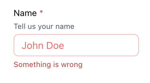
すべてのオプションを使用する場合は以下のように書きます。
return (
  <FormControl
    labelText="Name"
    helperText="Tell us your name"
    error="Something is wrong"
  >
    <TextInput required placeholder="John Doe" />
  </FormControl>
);
HTMLは以下のように出力されます。id はコンポーネント内で自動で振られ、 label 要素に適切に紐付けられます 。また、 aria-describedby などの属性も付与されています。
<div class="FormControl">
  <label for=":r1:" id=":r1:--label">Name</label>
  <div id=":r1:--helper-text">Tell us your name</div>
  <input
    id=":r1:"
    aria-describedby=":r1:--helper-text :r1:--error-text"
    aria-invalid="true"
    placeholder="John Doe"
  />
  <div id=":r1:--error-text">Something is wrong</div>
</div>
以下がスタイル例です。CSSについては今回はあまり触れませんが、 error propを渡すことでクラス名を付与したり、 &:has([required]) セレクターで必須項目のアスタリスクを疑似要素として表示したりできます。
:has() はFirefoxではまだ実装されていません。
実装方法
方針
前提として、上記の TextInput の部分には任意のユーザー入力系コンポーネントを柔軟に渡せることが求められます。すべてのフォーム要素が input とは限らないので、いい感じに疎結合になっているべきです。
今回はReactの Context をインターフェイスとして使用することにします。FormControl はchildrenとして受け取ったユーザー入力要素に適切なマークアップを付け加え、 Context.Provider でラッピングし、自動生成した id などを渡します。これによって、子要素は自分が使うべき id やその他の情報を useContext で受け取ることができます。
Contextを定義
以下のように FormControlContextValue を定義します。
import React from "react";

export type FormControlContextValue = {
  id: string | undefined;
  labelId: string | undefined;
  helperTextId: string | undefined;
  errorTextId: string | undefined;
  isError: boolean | string;
};

export const FormControlContext = React.createContext<FormControlContextValue>({
  id: undefined,
  labelId: undefined,
  helperTextId: undefined,
  errorTextId: undefined,
  isError: false,
});

export function useFormControlContext() {
  return React.useContext(FormControlContext);
}
FormControlを実装
ユーザー入力要素に渡す id は React.useId でひとつだけ生成し、他のIDはsuffixをつけることにします。すべてを FormControlContext.Provider で囲っていること以外に変わったことはしていません。
import React from "react";

import { FormControlContext } from "./FormControlContext";

export type FormControlProps = {
  labelText: string;
  helperText?: string;
  error?: boolean | string;
  children: React.ReactNode;
};

export function FormControl({
  labelText,
  helperText: helperText,
  error = false,
  children,
}: FormControlProps) {
  const id = React.useId();
  const labelId = `${id}--label`;
  const helperTextId = `${id}--helper-text`;
  const errorTextId = `${id}--error-text`;
  const ctxValue = {
    id,
    labelId,
    helperTextId,
    errorTextId,
    isError: !!error,
  };

  return (
    <FormControlContext.Provider value={ctxValue}>
      <div>
        <label htmlFor={id} id={labelId}>
          {labelText}
        </label>
        {helperText && <span id={helperText}>{helperText}</span>}
        {children}
        {typeof error === "string" && <span id={errorTextId}>{error}</span>}
      </div>
    </FormControlContext.Provider>
  );
}
Inputを実装
最初の例では TextInput というコンポーネントで説明しましたが、よりジェネリックな Input を先に実装します。 useFormControlContext() を呼ぶことで、自分を覆っている FormControl が提供している値を使うことができます。
aria-describedbyは複数のIDをスペース区切りで指定することができるので、補足説明なテキストとエラーメッセージの両方を渡します。aria-invalidに渡すisErrorは、errorにTruthyな値(trueまた空文字でないstring)が指定されたときにtrueになります。input[aria-invalid="true"]のようなCSSセレクターでエラー時のスタイリングができます。
import React from "react";

import { useFormControlContext } from "../FormControl/useFormControlContext";

type Props = JSX.IntrinsicElements["input"];

export const Input = React.forwardRef<HTMLInputElement, Props>(
  (props, forwardedRef) => {
    const { id, helperTextId, errorTextId, isError } = useFormControlContext();
    return (
      <input
        id={id}
        aria-describedby={[helperTextId || "", errorTextId || ""].join(" ")}
        aria-invalid={isError}
        ref={forwardedRef}
        {...props}
      />
    );
  }
);

Input.displayName = "Input";
この実装だと aria-describedby に余計なスペースが入る場合があるので、なんらかのフィルタリングはしたほうがいいかもしれません。
Inputを拡張する
上記の Input コンポーネントをそのまま使ってもいいですし、type を指定することで限定的な TextInput または Checkbox のような拡張コンポーネントを作ることもできます。外部ライブラリなどであっても id は指定できることが多いと思うので簡単に組み込めるはずです。
その他に考慮したこと
ネストされた場合はどうなる?
Contextは直近のProviderの値を参照するので、FormControl がネストされても問題ありません。なので以下のように使用できます。
export function RadioGroup({ children }: RadioGroupProps) {
  const { labelId } = useFormControlContext();
  return (
    <div role="radiogroup" aria-labeledby={labelId}>
      {children}
    </div>
  );
}
return (
  <FormControl labelText="PPAP">
    <RadioGroup>
      <FormControl labelText="Pen">
        <Input type="radio" name="ppap" value="pen" />
      </FormControl>
      <FormControl labelText="Pineapple">
        <Input type="radio" name="ppap" value="pineapple" />
      </FormControl>
      <FormControl labelText="Apple">
        <Input type="radio" name="ppap" value="apple" />
      </FormControl>
    </RadioGroup>
  </FormControl>
);
labelで囲ったらダメなのか?
確かに input を label の中に入れることで面倒なIDの管理は無くなりますが、aria-describedby やネストされたときの振る舞いもサポートするなら htmlFor で紐付けた方がいいと思います。それらが不要ならシンプルに囲ってしまってもいいと思います。
Context以外の実装方法は?
Render propもサポートしておくと便利かもしれません。
export type FormControlProps = {
  {...},
  children:
    | React.ReactNode
    | ((props: FormControlContextValue) => React.ReactNode);
};

function FormControl() {
  {...}
  return (
    {...}
    {typeof children === "function" ? children(ctxValue) : children}
    {...}
  )
}

function Component() {
  return (
    <FormControl labelText={labelText}>
      {({ id, helperTextId }) => (
        <input id={id} aria-describedby={helperTextId} />
      )}
    </FormControl>
  )
}
TODO
今回実装した FormControl でマークアップ上の問題はかなりの程度解決できたと思いますが、まだスタイリングやバリデーションなども残っています。
スタイリング
すべてのラベルや補足テキストが同じ場所・見た目で表示されるとは限りません。例えばラジオボタンはラベルを水平方向に配置したいはずです。FormControl の見た目は外部から柔軟に設定できるようにするべきです。
バリデーション
FormControl はマークアップの補助以上のことはしていないので、React Hook Formとの相性はかなりいいと思います。クライアントサイドの動作を加えたい場合は(FormControl をいじるというより)上位のレイヤーとして被せたほうが責務の分離がしやすいと思います。